We’ve just launched the ability to fully customize your OrangeQC account dashboard with a whole new suite of personalization options! This upgrade has been in the works for a while, and we’re so excited to put these tools in your hands.
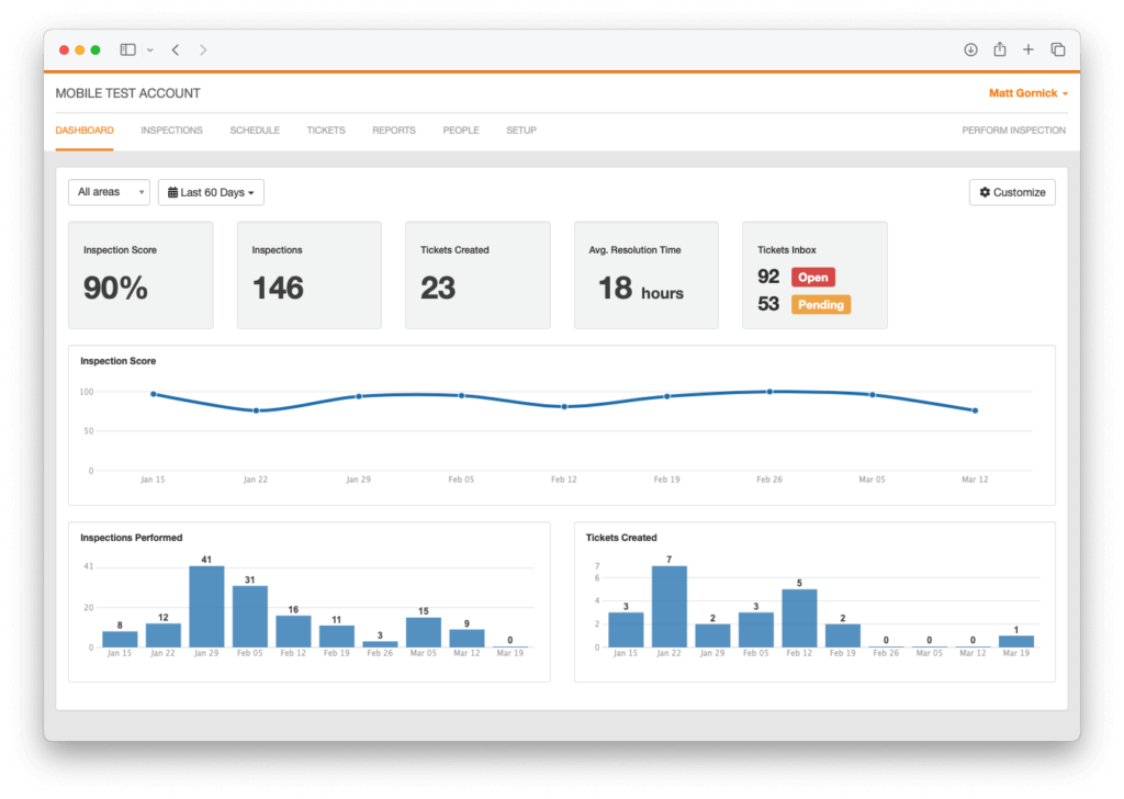
Custom dashboards make it easier to keep a pulse on the organization’s performance and see the most important metrics for your team, all at a glance.
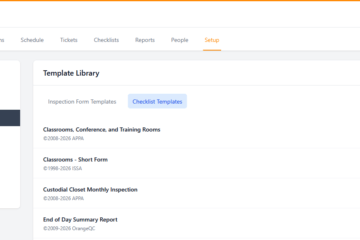
What can I do with the new dashboard options?
With this update, admins can:
- Choose which metrics and charts should pop up on the dashboard.
- Select from specific metrics (for example, the APPA score for classrooms, or the percentage score for different area types) in addition to the overall score for the entire organization.
- Pick the most relevant data for your team.
- Hide anything that’s not relevant.
The new and improved layout helps your team focus on your unique KPIs. It’s also maximized for everyday readability, telling the story of your current performance levels at a glance. Get as granular or as big-picture as you like; it’s all supported.
Which metrics can I choose to see?
Start with the following options. These can all be customized with filters for date ranges, inspection type, specific inspection form, and more, depending on the metric.
Inspection-based metrics:
- Inspection score
- Number of inspections
- Number of deficient inspections
- Number of flagged inspections
- APPA score
Ticket-based metrics:
- Number of tickets created
- Average first response time
- Average resolution time
- Ticket inbox stats
You can also add charts for inspection score, number of inspections performed, total number of tickets, and new tickets created.
Why customize the dashboard?
If you find yourself looking up the same stats regularly in OrangeQC, this is the update for you. Customizing your dashboard helps you quickly find the quality control data you use most regularly.
Dashboard customization also allows you to keep KPIs and quality control goals top of mind for your team members who use OrangeQC. For example, if you’re working to reduce average response time across all of your sites, putting this metric on the dashboard for your team will increase everyone’s awareness of where you currently stand.
How do I use the new dashboard tools?
Check out our dashboard customization help guide for a step-by-step introduction to the new options, as well as examples of what the new dashboard can do.
Not using OrangeQC? Start a free 30-day trial (no payment info required) and see how the dashboard customization options work firsthand.